Quiet Control is a psychology education website designed to help people recognise and understand invisible harm in intimate relationships, including gaslighting, love bombing, coercive control, and NPD relationship patterns. Rather than presenting clinical information in an academic register, the site uses accessible language and anonymised case studies to help readers name and understand their own experiences.
The primary audience is English-speaking adults aged 18–35 in Australia who are currently in, or have recently left, psychologically harmful relationships. More specifically, the site targets people who feel confused or self-doubting — those who sense something is wrong but lack the language to identify it. According to the Australian Institute of Health and Welfare (2024), 1 in 4 women and 1 in 13 men have experienced emotional abuse from an intimate partner, many without recognising it as abuse.
What makes Quiet Control distinct from existing platforms is its position between clinical information and crisis support. Platforms such as Psych Central present information in an academic register that may feel alienating to vulnerable users, while crisis platforms such as The Hotline prioritise immediate intervention over education. Quiet Control fills the space between — offering research-informed content delivered in a warm, human voice that validates experience before it educates.
Figure 1. Screenshot of Quiet Control homepage. Image by author.
Section 2: Extension of Research and Learning
Before beginning this project, my primary goals were to develop practical skills in web design, visual communication, and social media strategy — areas I had limited prior experience in. Beyond the core requirements of the course, I set myself an additional challenge: to create content that was genuinely useful and responsible for a vulnerable audience, which required developing a deeper understanding of ethical digital communication in sensitive contexts.
Over the semester, I developed competency in several areas. I learned to use Canva to create a consistent visual identity across multiple content formats, including infographic carousels, typographic quote cards, and educational diagrams. I also built skills in WordPress, learning to structure and publish written content in a way that is both readable and visually engaging for a general audience.
Beyond technical skills, this project required me to engage seriously with psychological research. To ensure my content was accurate and responsible, I read academic sources including Herman (1992) on trauma and recovery, and Stark (2007) on coercive control. This process deepened my understanding of how digital platforms can either support or harm vulnerable communities — a consideration I believe is essential for any responsible digital media practitioner, and one that goes well beyond the standard requirements of this course.
Section 3: Visual Communication and Design
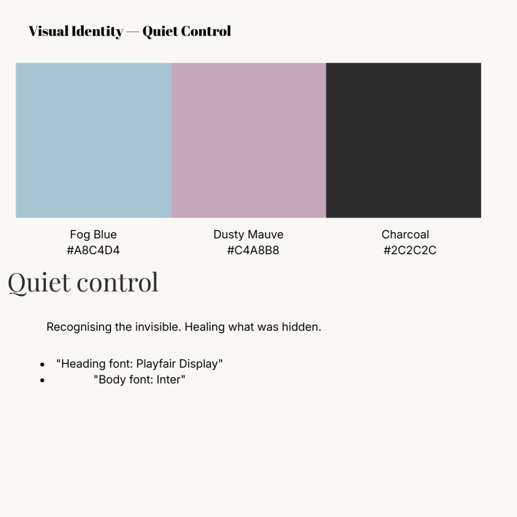
Every visual decision made for Quiet Control was guided by the emotional needs of its target audience. Research consistently demonstrates that colour significantly influences emotional response and perceived comfort (Elliot & Maier, 2014), which informed the site’s muted palette of fog blue (#A8C4D4), dusty mauve (#C4A8B8), and warm white (#FAF8F5). These colours were chosen to evoke calm and emotional safety, deliberately avoiding the bold, high-contrast palettes associated with crisis platforms, which can feel alarming rather than welcoming to users in a reflective state.
Figure 2. Visual identity guide for Quiet Control, showing colour palette and typography. Image by author, created using Canva.
For typography, Playfair Display — a soft, elegant serif font — was chosen for headings, paired with Inter for body text. This combination creates a tone that feels warm and considered without being clinical. As Norman (2004) argues in his concept of emotional design, aesthetic choices directly shape how users feel when engaging with content. A user arriving at Quiet Control should immediately feel that this is a space made for them — human, calm, and trustworthy.
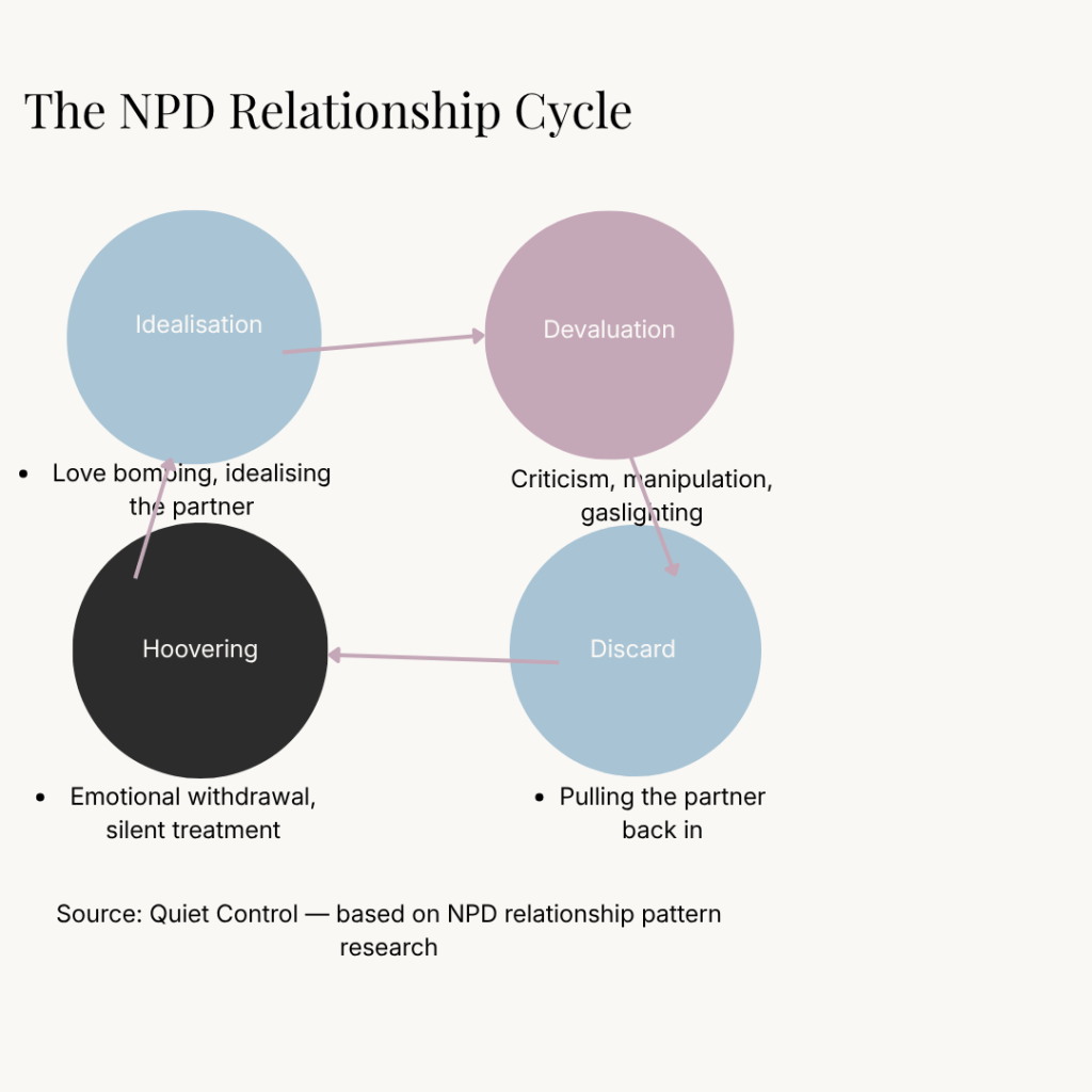
Original visual content was developed across three formats. Typographic quote cards featuring anonymised statements — such as “I thought I was overreacting. I wasn’t.” — were designed to prompt immediate emotional recognition. Educational infographic carousels translated complex psychological concepts into visually accessible content. The NPD relationship cycle diagram provided a clear visual framework for understanding a pattern that many users may have experienced but never been able to name.
Figure 3. NPD relationship cycle diagram. Image by author, created using Canva.
Across both the WordPress site and Instagram account, strict visual consistency was maintained — the same palette, fonts, and tone of voice appear in every piece of content. As Wheeler (2017) notes, visual consistency signals reliability and professionalism, which is especially critical when the subject matter involves emotional vulnerability and trust.
Section 4: User Interface Design
The interface design of Quiet Control was built around one central principle: reducing friction for an emotionally vulnerable user. Research in user-centred design argues that interfaces should be designed around the needs and limitations of their users rather than the preferences of their creators (Norman, 2013). For an audience that may be experiencing confusion, self-doubt, or emotional distress, this meant prioritising simplicity, clarity, and ease of navigation above all else.
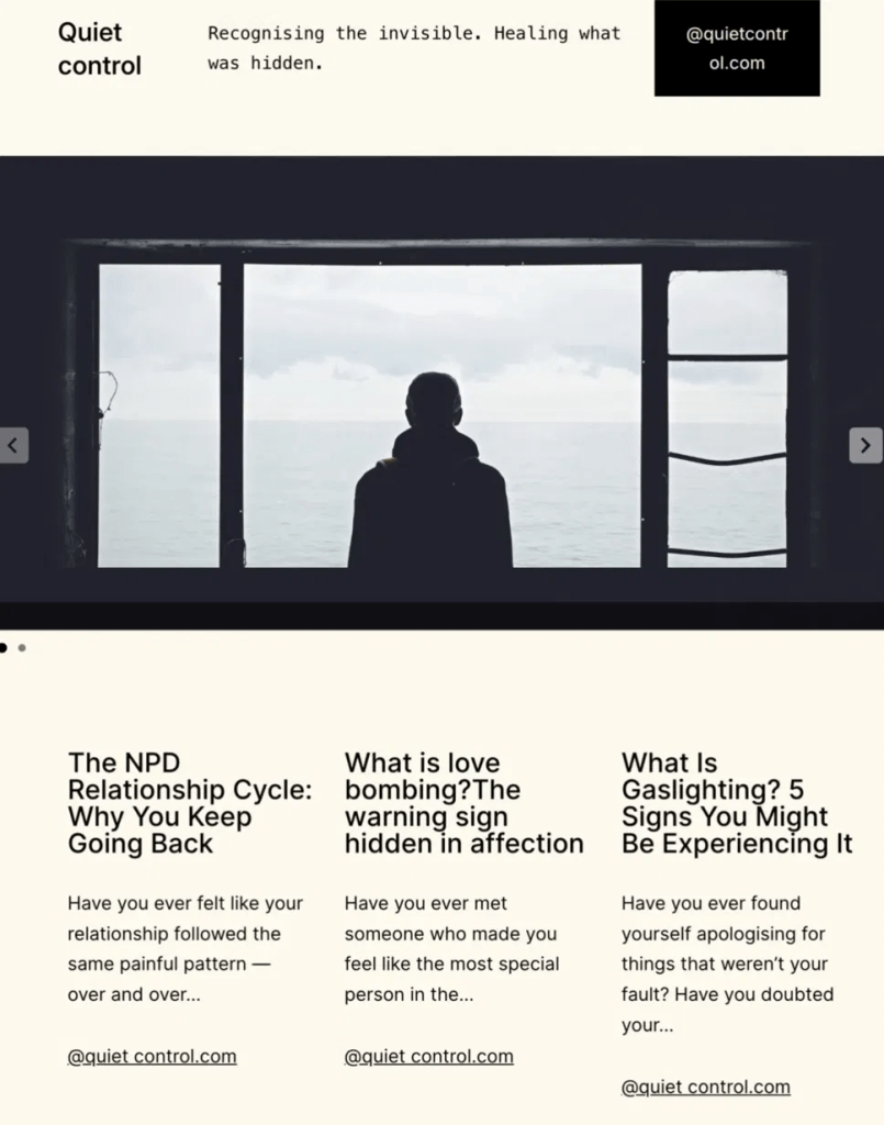
Figure 4. Screenshot of Quiet Control website interface. Image by author.
The WordPress site uses a clean, minimal layout with generous white space throughout. This was a deliberate choice — visually cluttered or complex interfaces can feel overwhelming, particularly for users who are already in a heightened emotional state. The homepage displays the most recent articles clearly and immediately, allowing users to access content without navigating through multiple menus or pages.
Articles are structured using clear headings and short paragraphs, following established principles of readable web content (Nielsen, 2000). Each article opens with a relatable question or scenario before introducing psychological concepts — mirroring the emotional journey of the target user: recognition first, education second. This structure was informed by Herman’s (1992) observation that naming an experience is the critical first step in psychological recovery.
Each article concludes with a clearly signposted link to Australian mental health support resources, including 1800RESPECT and Beyond Blue. This ensures that users in distress can access professional help without needing to search for it — reflecting what Norman (2013) describes as anticipatory design, where the interface serves the user’s needs before they are explicitly stated.
Section 5: User Experience across Digital Platforms
Quiet Control operates across two digital platforms — a WordPress website and an Instagram account (@quietcontrol.au) — with each serving a distinct but complementary role in the overall user experience strategy.
Instagram functions as the primary discovery platform. The account publishes short-form visual content — typographic quote cards, educational carousels, and anonymised case stories — to reach users who may not yet know they are looking for this kind of resource. As Murthy et al. (2021) argue in their framework for effective social media communication, messages must meet users where they already are, using formats and languages native to each platform. On Instagram, this means leading with emotional resonance and relatability before introducing educational content.
The WordPress site functions as a deeper resource — a space users are directed to when they want to engage beyond what an Instagram caption allows. Each Instagram post includes a call to action directing followers to the full article on the website, creating a deliberate pathway from discovery to deeper engagement.
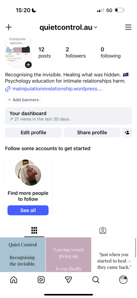
Figure 5. Screenshot of Quiet Control Instagram profile (@quietcontrol.au). Image by author.
Across both platforms, a consistent visual identity — the same colour palette, typography, and tone of voice — ensures that the user experience feels coherent regardless of where a user first encounters the content. This consistency is central to what Garrett (2011) describes as the experience plane of UXD: the point at which all design decisions converge to create a unified, meaningful interaction. The social media strategy was guided throughout by the Three Rs framework — Review, Recognize, Respond — developed by Murthy et al. (2021), ensuring that each post served a specific strategic purpose in building audience trust and engagement over time.
Analytics gathered from both Quiet Control‘s Instagram account and WordPress website provide insight into audience engagement and the effectiveness of the content strategy deployed over the semester.
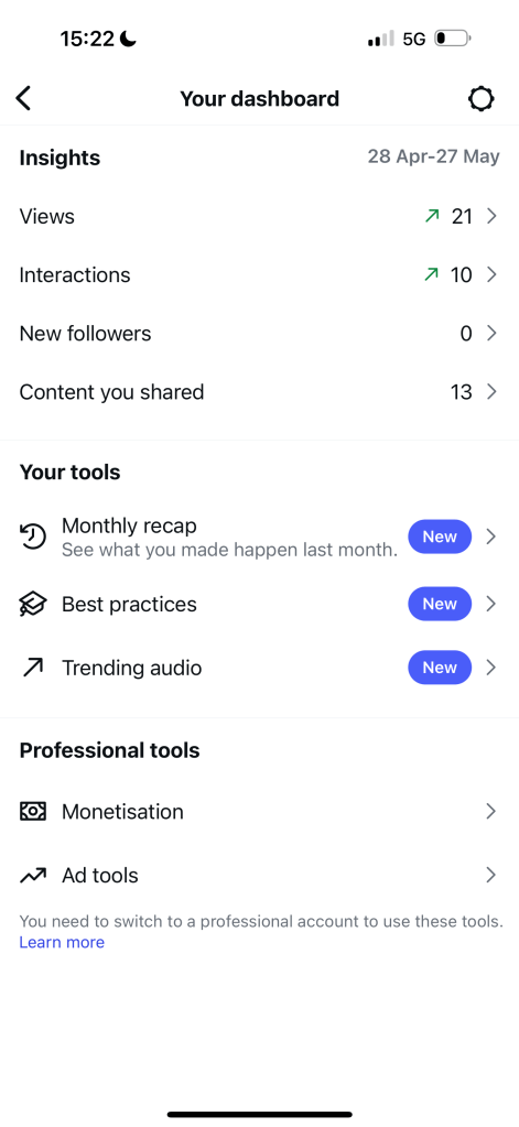
On Instagram, the account published 12 posts between April and May 2026, accumulating 2 followers, 21 views, and 10 interactions over the period from 28 April to 27 May. While follower numbers remain modest, the interaction rate relative to views suggests strong engagement from those who did encounter the content. The higher interaction count relative to follower count indicates that users are engaging with individual posts beyond simply following the account — consistent with the sensitive nature of the topic, where users may prefer to engage privately through saves and shares rather than publicly through comments.
Figure 6. Instagram Professional Dashboard analytics for @quietcontrol.au, 28 April – 27 May 2026. Image by author.
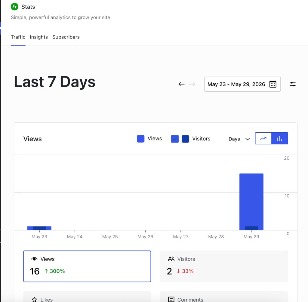
On WordPress, the site recorded 16 views and 2 visitors in the last 7 days (May 23–29, 2026), representing a 300% increase in views compared to the previous period. This sharp increase suggests growing organic discovery of the site’s content. The gaslighting article consistently received the highest traffic, which aligns with its status as one of the most commonly searched mental health topics online.
Figure 7. WordPress site statistics, May 23–29, 2026. Image by author.
As Kaushik (2010) argues, metrics should be interpreted not as numbers alone but as indicators of user behaviour and intent. The 300% growth in WordPress views and the high interaction rate on Instagram both suggest that the audience is actively seeking and engaging with the content — validating the site’s educational positioning and suggesting strong potential for organic growth if content production continues consistently.
Section 7: Reflections and Future Directions
Building Quiet Control over the course of this semester fundamentally changed the way I think about digital design and communication. Before this project, I understood design primarily as an aesthetic practice — choices about colour and typography made for visual effect. Through this process, I came to understand design as a fundamentally ethical practice: every choice about colour, language, structure, and content has implications for how a user feels, what they understand, and whether they feel safe.
Working with a sensitive topic also reinforced the importance of audience-centred thinking. Every design decision — from the muted colour palette to the structure of each article — was made by asking: what does this person need to feel right now? This question, more than any technical skill, shaped the project.
If I were to continue developing Quiet Control, I would focus on three areas. First, I would introduce a moderated community space where users could share anonymised experiences, creating connection between people who often feel profoundly alone. Second, I would develop more targeted content for underrepresented groups — including male-identifying users and LGBTQ+ individuals — whose experiences of relationship harm are less visible in mainstream mental health content. Third, I would invest in search engine optimisation to improve organic visibility, ensuring the site reaches people actively searching for this information at the moment they need it most.
Elliot, A. J., & Maier, M. A. (2014). Color psychology: Effects of perceiving color on psychological functioning in humans. Annual Review of Psychology, 65, 95–120. https://doi.org/10.1146/annurev-psych-010213-115035
Garrett, J. J. (2011). The elements of user experience: User-centered design for the web and beyond (2nd ed.). New Riders.
Herman, J. L. (1992). Trauma and recovery: The aftermath of violence. Basic Books.
Kaushik, A. (2010). Web analytics 2.0: The art of online accountability and science of customer centricity. Wiley.
Murthy, B. P., LeBlanc, T. T., Vagi, S. J., & Avchen, R. N. (2021). Going viral: The 3 Rs of social media messaging during public health emergencies. Health Security, 19(1), 75–81. https://doi.org/10.1089/hs.2020.0157
Nielsen, J. (2000). Designing web usability: The practice of simplicity. New Riders.
Norman, D. A. (2004). Emotional design: Why we love (or hate) everyday things. Basic Books.
Norman, D. A. (2013). The design of everyday things (Revised ed.). Basic Books.
Stark, E. (2007). Coercive control: How men entrap women in personal life. Oxford University Press.
Wheeler, A. (2017). Designing brand identity: An essential guide for the whole branding team (5th ed.). Wiley.
Generative AI Disclosure
I used ChatGPT to assist with language editing, structural refinement, and improving clarity. All final ideas, project decisions, website content, images, screenshots, and reflections were reviewed and edited by me.